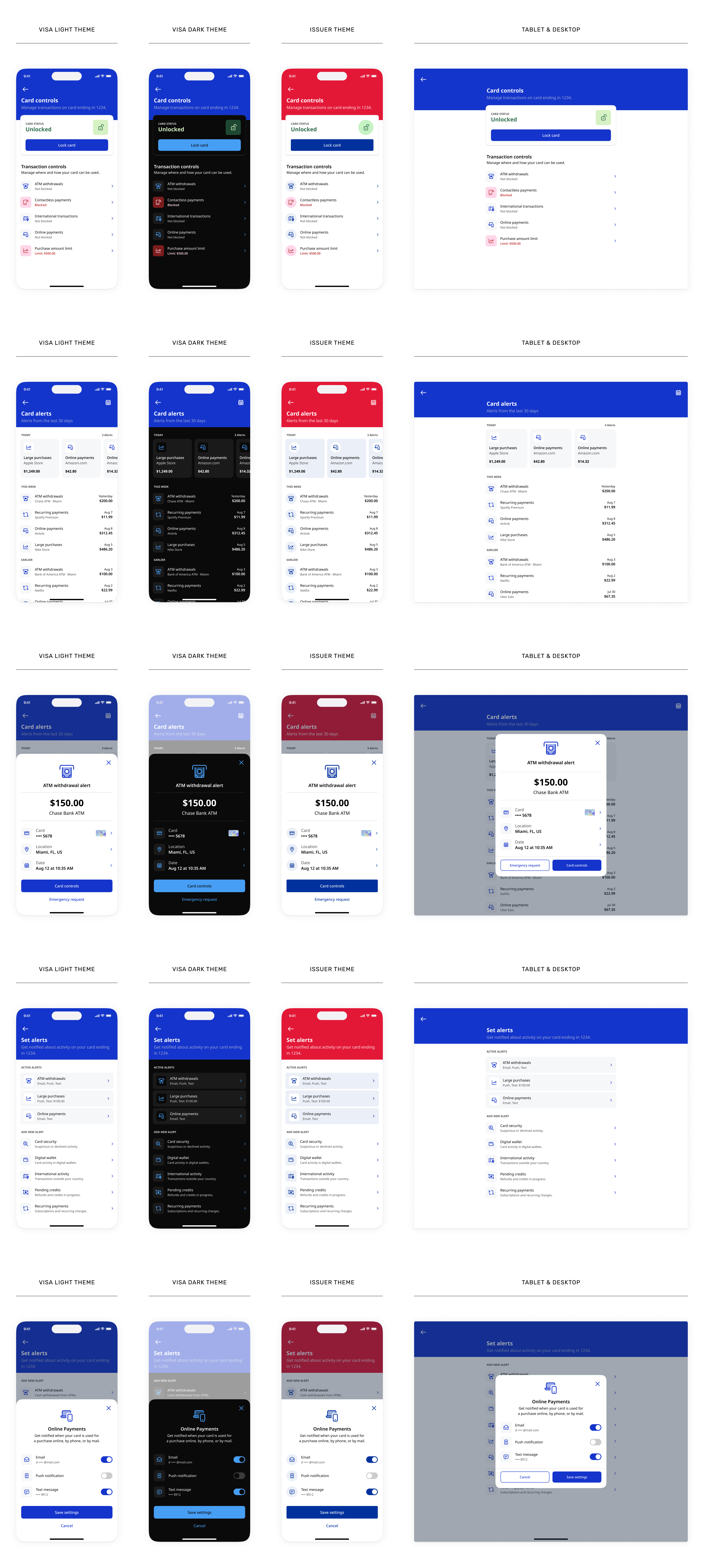
VTC organized the experience around three entry points that issuers could surface independently or combine within a broader card-management journey.
Issuers needed different levels of ownership over the experience. Some adopted complete Visa-designed interfaces, while others integrated individual capabilities or created native presentation layers around VTC behavior.
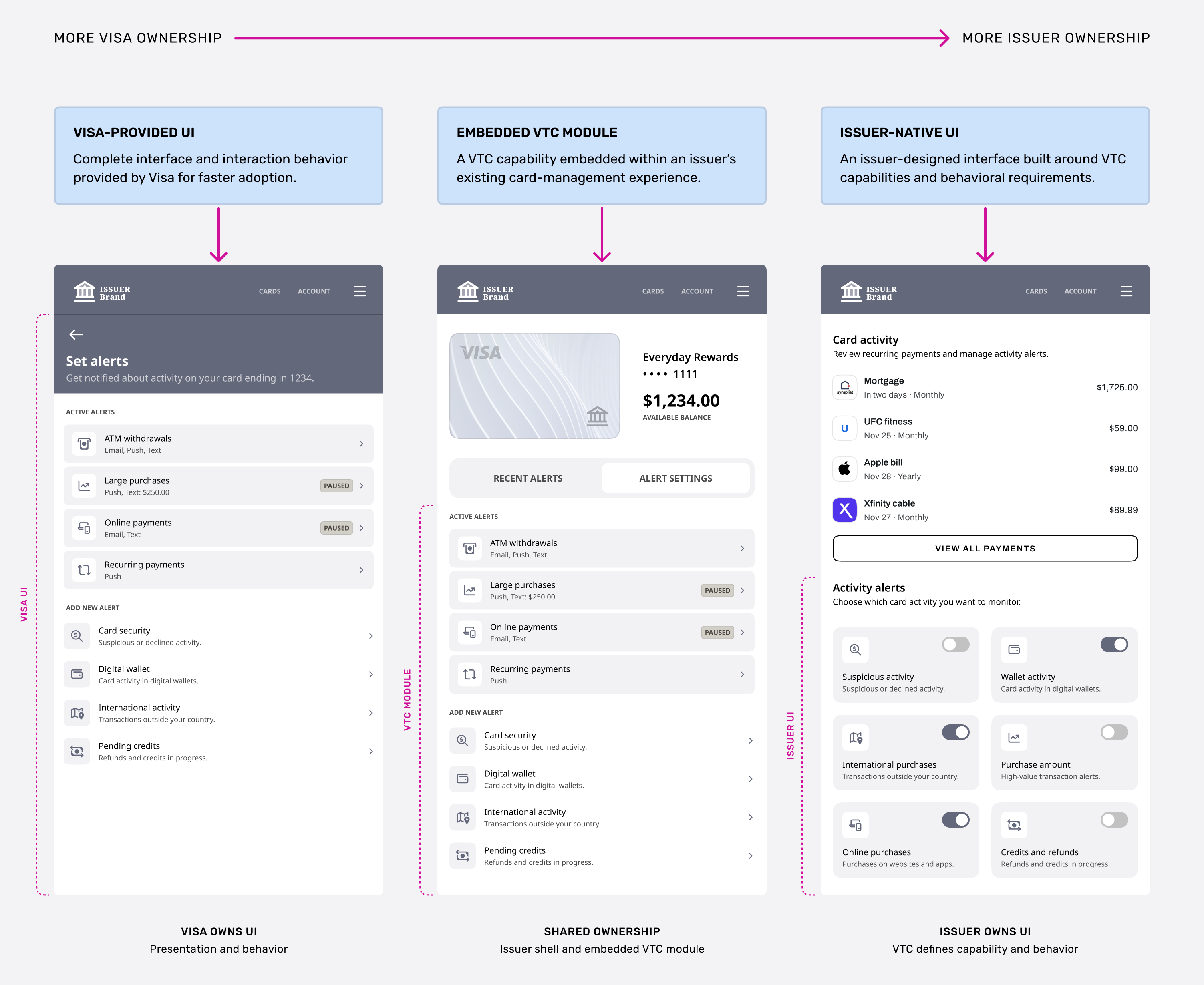
VTC needed to work across mobile and larger surfaces without treating each screen size as a separate design. I defined how content hierarchy, components, and actions should adapt as the available space changed.
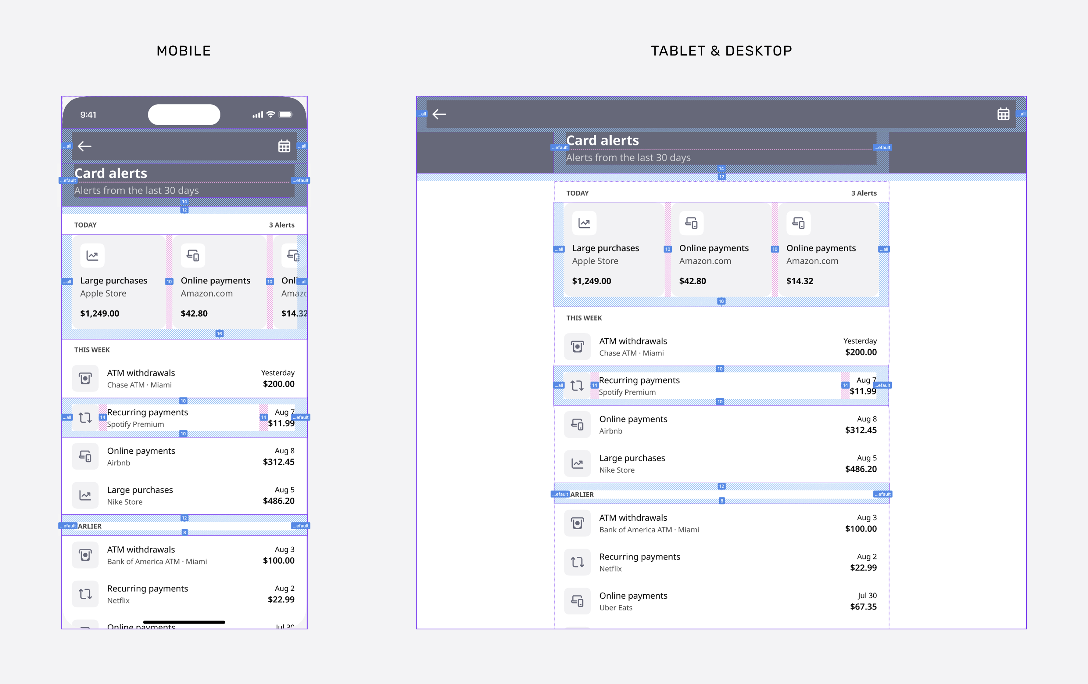
Built as one adaptive layout rather than separate device designs. Shared hierarchy, components, and constraints help engineering scale the experience across breakpoints with less device-specific work.
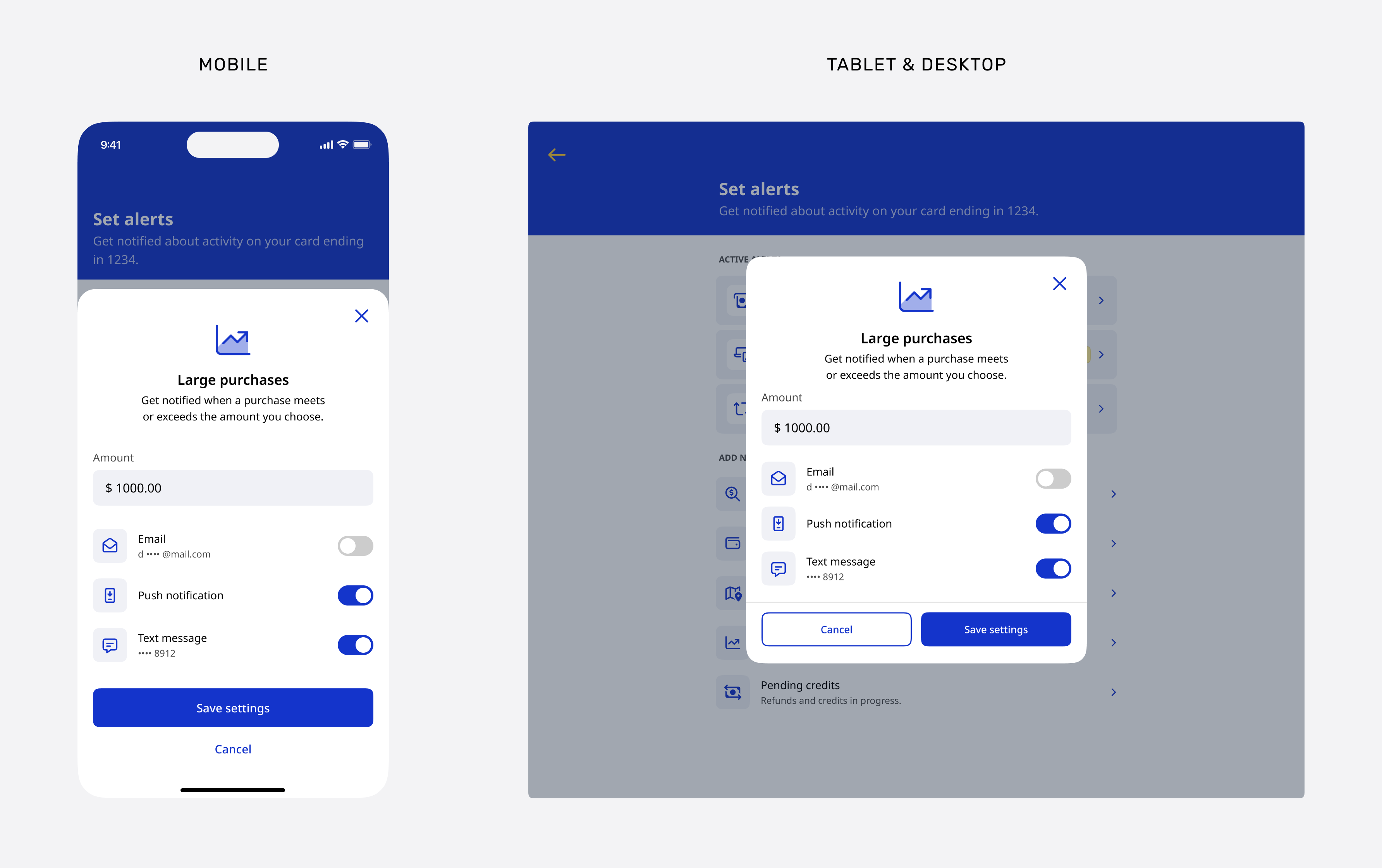
Bottom sheet vs. modal. The same task adapts its container and actions while preserving its content and outcome.
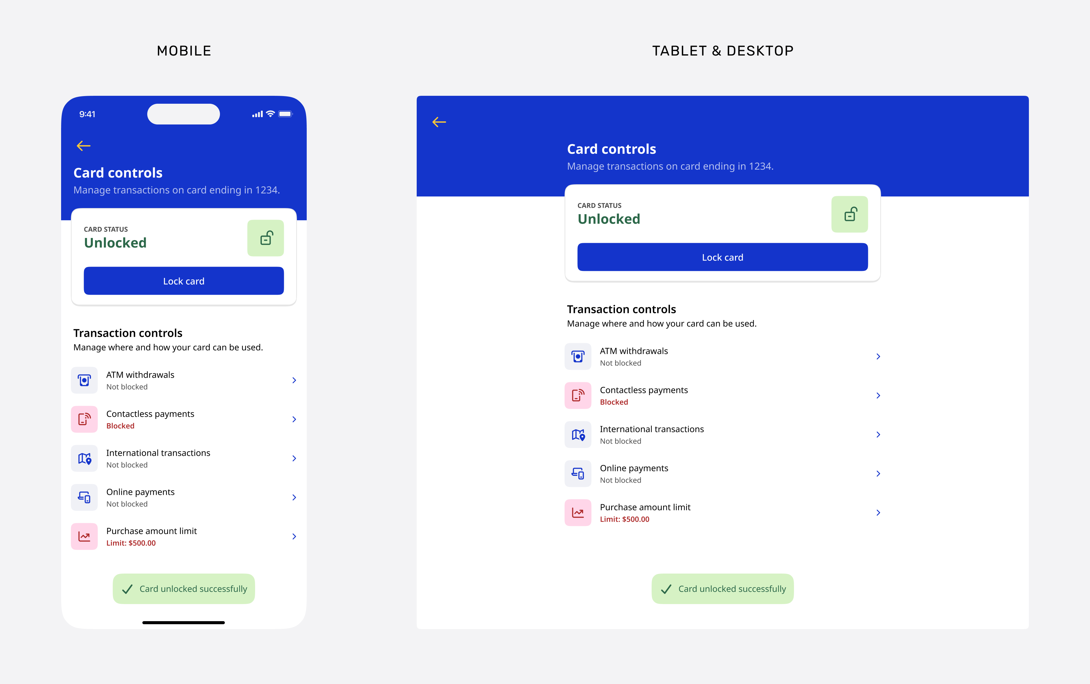
Card controls preserve action placement, control states, and confirmation feedback across screen sizes.
Because VTC could be integrated by different engineering teams, the design files needed to communicate more than visual appearance. I documented interaction states, transitions, system feedback, responsive rules, and integration boundaries alongside the experience so teams could implement the intended behavior consistently.
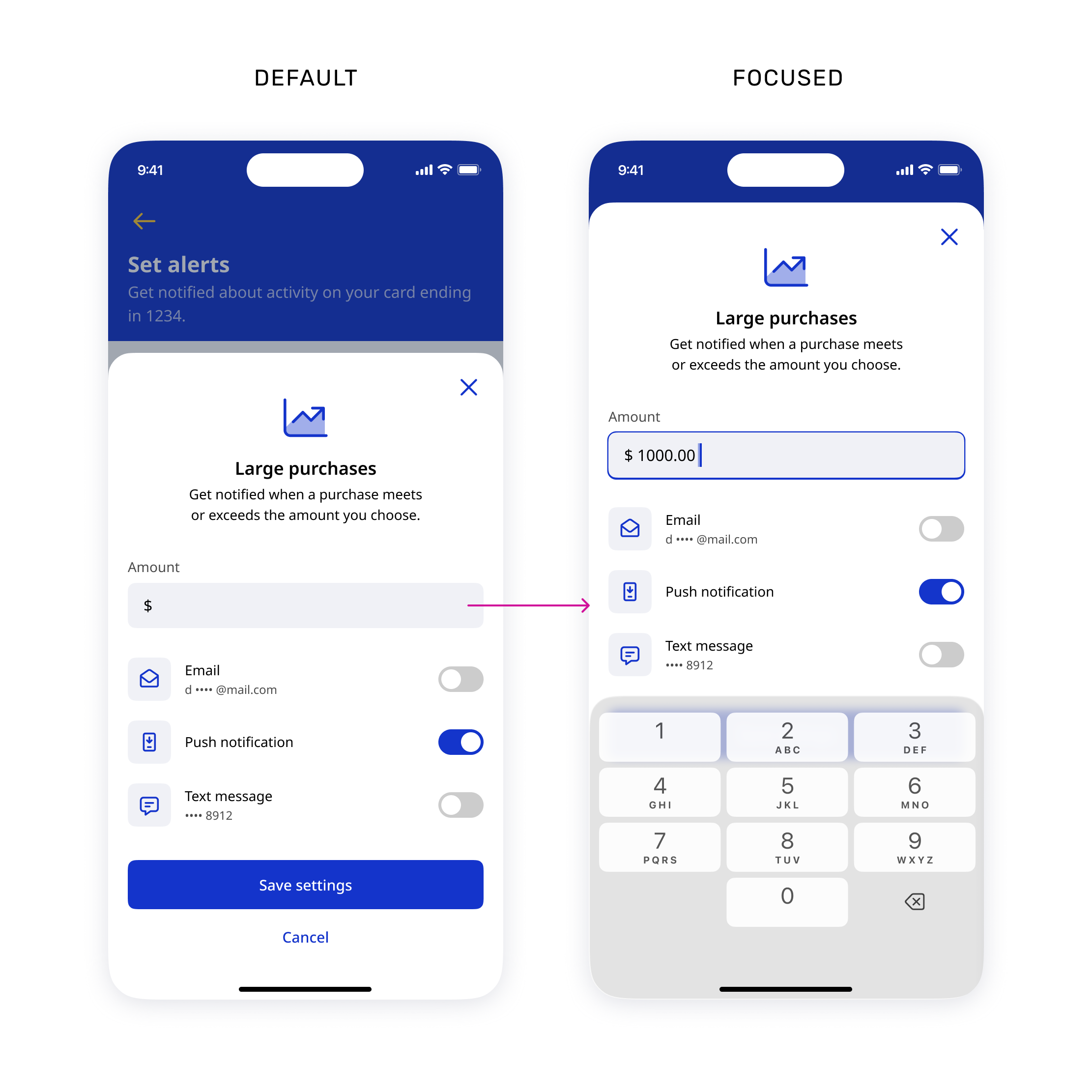

Documented how components should respond throughout an interaction, not only in their final state.
- Default and focused states
- Selected and disabled states
- Loading and processing behavior
- Success, error, and recovery states
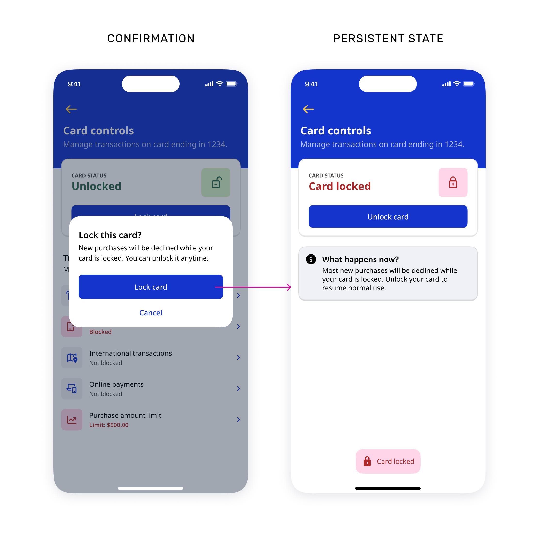

Defined how the experience communicates progress, confirms outcomes, reflects persistent changes, and helps cardholders recover when an action cannot be completed.
- Immediate action confirmations
- Persistent state changes
- Loading and processing feedback
- Errors and recovery paths
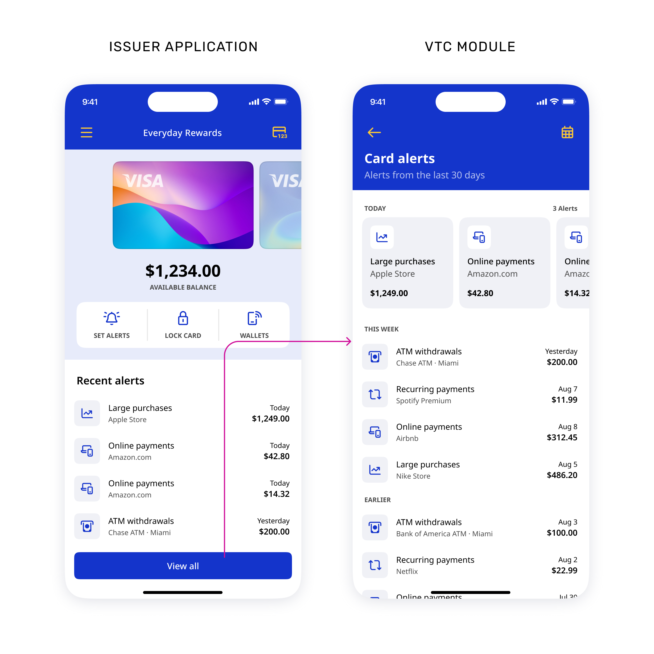

Clarified how responsibilities, navigation, data, and behavior should be coordinated between VTC and the issuer application.
- VTC-owned behavior and states
- Issuer-owned navigation and destinations
- Entry and exit points
- Context passed between experiences


VTC separated product behavior from visual presentation, allowing issuers to apply their brand across the experience without redefining its underlying structure. Color, corner treatments, and typography could adapt while information hierarchy, interaction patterns, semantic states, and feedback remained consistent.
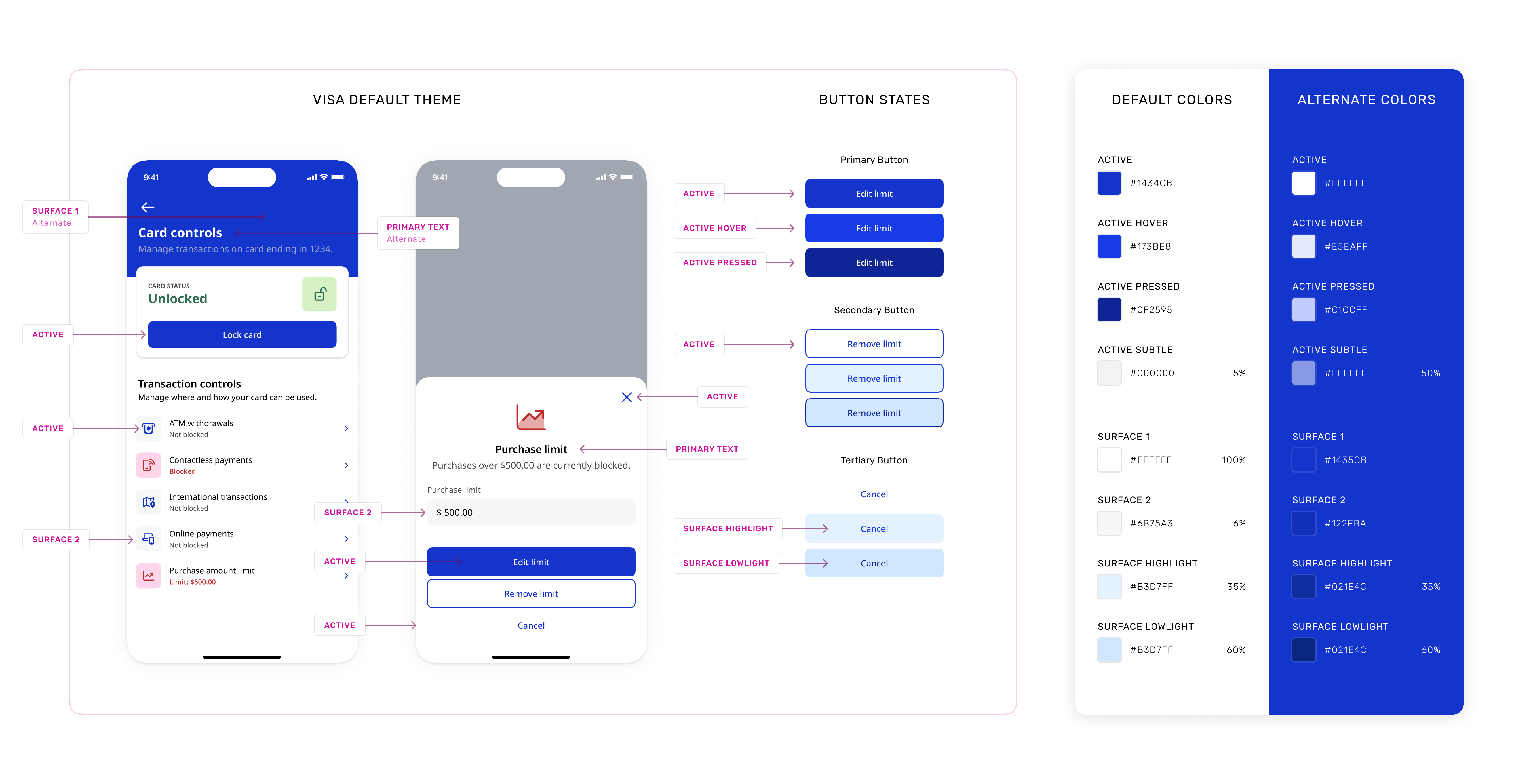
A sample of Active and Surface color groups, showing how their default and alternate values support different backgrounds and interaction states.
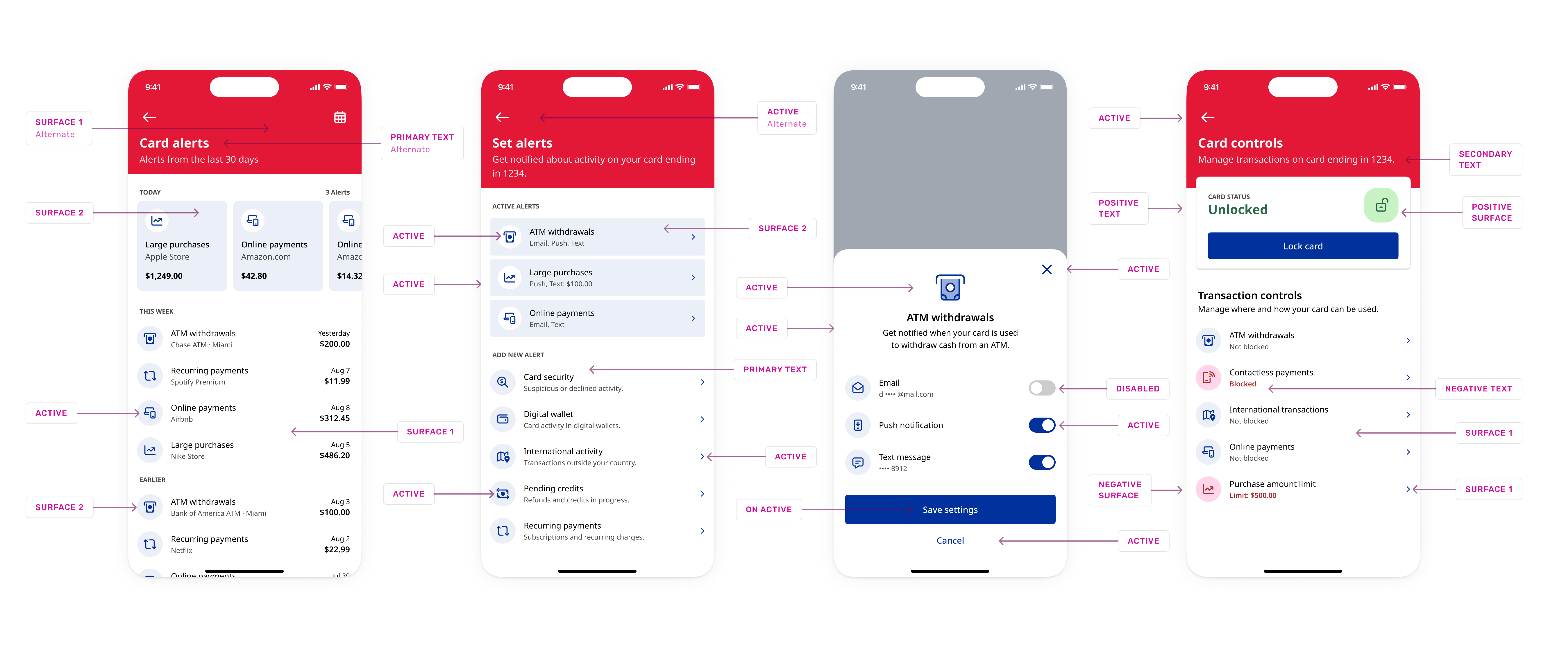
Additional semantic color roles applied across VTC, including text, status, disabled, and on-active treatments.
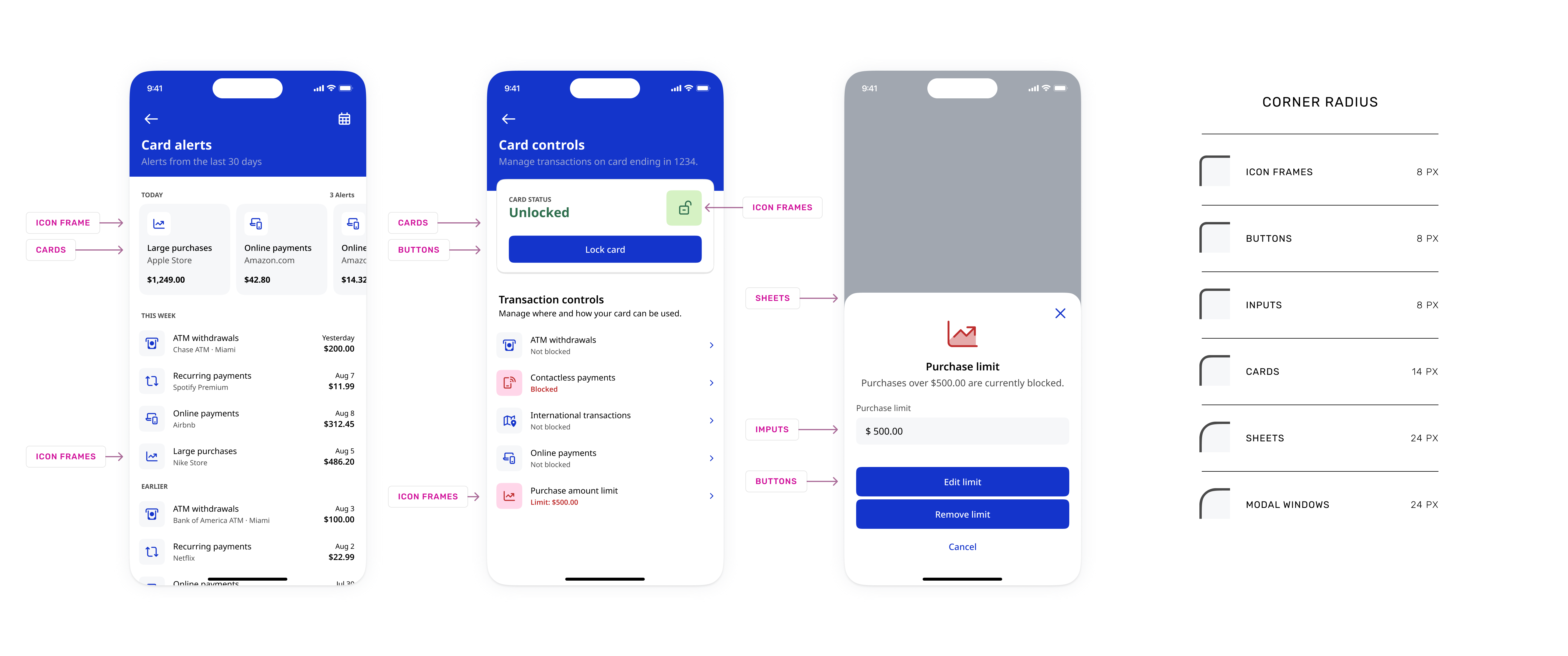
Corner radius values applied across icon frames, buttons, inputs, cards, sheets, and modal windows.
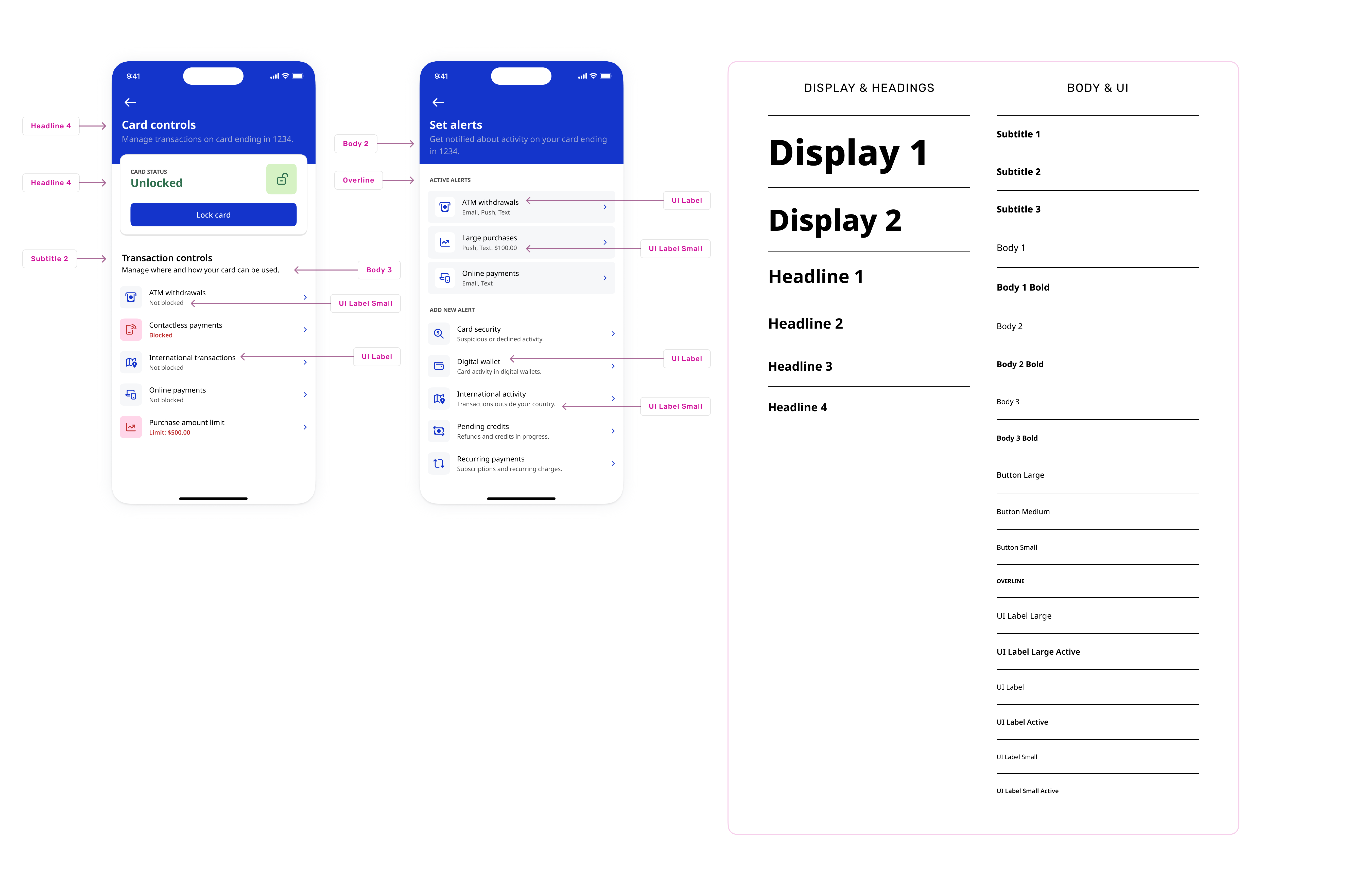
Examples of how the shared typography hierarchy maps to headings, body copy, and UI labels across the experience.